Effacing a Museum
John Haberin New York City
The Museum of Arts and Design: Second Lives
More and more, museums are competing as sites for celebrity architecture. Has a museum ever hired an architect, however, to efface famous architecture? For its new home, the Museum of Arts and Design asked Brad Cloepfil for just that, and the assignment goes a long way to explain his heroic but mixed results.
One can easily make fun of the results, which opened in September 2008, and in fact I did. What are the some of the museum's new features? In that separate bit of showing off, I get "hopping MAD." What, however, has motivated the whole affair? It comes down to an institution's stake in fine art, and the inaugural show, "Second Lives," makes clearer still what that involves. 
The madhouse
Why efface a museum? The Museum of Arts and Design wanted out. It wanted out of the shadow of the Museum of Modern Art, right across from its last home, on 53rd Street. It wanted out of its near invisibility, now that art is anything but. It wanted out of its own history, first as the Museum of Contemporary Crafts and then as the American Craft Museum. It wanted to go MAD.
Two Columbus Circle promised so much more. It promised a fabulous site, at the confluence of three major arteries, facing a memorial and the foot of Central Park, across from two of New York's most highly rated restaurants, and as a gateway to the Theater District or to the Upper West Side. It promised more space and publicity. The museum banished craft from its name and added arts back in 2002, but no one seemed to know. It even promised a legendary building. Edward Durrell Stone's 1964 marble tower had landed on more lists of endangered buildings and landmarks in waiting than one can count.
Only one thing stood in its way, the building, and you may already know the story by heart. On the one hand, it was all but unworkable and totally laughable. Stone's design for the tiny traffic island had two emergency stairwells, leaving a small, cramped space for art. The exterior all but barred natural light, while letting in no end of derision. Ada Louise Huxtable, of course, got the ball rolling when she called it the Lollipop Building, since its entire weight appeared to rest on tiny arches and pedestals. I still cringe at memories of the fussy, pockmarked marble.
On the other hand, supporters wanted it to stay put. For many, it represented a last chance to roll back the clock before modern architecture—and modern art. Huntington Hartford had commissioned the building for his eccentric private collection. I thought of the A&P heir again, when a service door opened to the rear, and traffic roared past just yards from the front desk. It underscored the narrow white tower and its history. It underscored, too, what the tower meant, as a monument to a wealth, privilege, bad ideas, and awful taste.
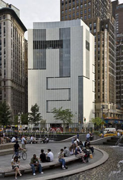
As a way out, MAD offered something to everyone. Cloepfil preserves some of the façade, with all but one of the lollipops. He just covers it over. He has consolidated the stairs, adding interior space. He brings in the sun, through a surface of terra cotta and glass. I have not seen the ninth-floor restaurant, which has the most glass and opens in 2009, but I could learn to enjoy these galleries—up to a point.
A gesture of preservation, quotation, and erasure sounds like a textbook exercise in deconstruction. In practice, it is a compromise, like architecture by committee, and compromises do not often serve either form or function. Cloepfil ran into real limits, from the site's to a museum's madhouse, even before other museums face financial meltdown. Yet the compromise does him in.
HE, SHE, and IT
The site's physical limits will not go away. The lobby has room for a gift shop, but that drives the coat check downstairs, with only a slim corridor beside the theater. If the museum ever draws a crowd dressed for winter, they will have nowhere to wait in line. The U-shaped galleries around a central shaft allow flexible sightlines and spaces for large and small works. The stairs do not feel like an afterthought or an emergency measure as at the New Museum on the Bowery. Still, one can shrug off a visit to these small floors as quickly as to a gallery building in Chelsea.
The site has emotional limits, too. One has the experience of crossing to a traffic island. One has a monument to an even tackier billionaire than Hartford to the north, in a Trump hotel. The Time-Warner complex to the west rests two bland, bulky glass towers above an even bulkier and more pedestrian arc, echoing the Coliseum convention center that it replaced. Another cookie-cutter glass tower rises to the south, while an older neighbor, in white brick and terraces to the east along Central Park South, might have just floated in from Miami Beach. Together, they add up to not a gateway but a barrier.
Still, such cretinous surroundings offered an opportunity. How could Cloepfil not look good by comparison? It comes back to the compromises—and to an architect who takes to them too naturally. One can see it in the building's limits. Nicolai Ouroussoff in The New York Times had a point in wishing he had just torn the thing down. One can also see it, though, in the appearance.
Take the lollipops. From the outside, the terra cotta covers the top of the arches, leaving the shapes incoherent. From the inside, they look like molded plastic affixed to the walls for no good reason. On the rest of the façade, the glass and the white spell out HE, in huge, partly interlaced block letters. Almost as bad, the cryptic message from Mr. Museum is less obvious in person than in photos. Up close, the terra-cotta slats look like venetian blinds, and the entirety looks like the grille work of a utility shaft, as if the building had turned inside-out.
Modernism might admire the result, as if the building were acknowledging its nature as an object. Postmodernism might like the pun. One might do better, though, to think of an architect too fixated on the details of what people want, inch by inch and floor by floor. Cloepfil did not intend or even notice the word HE. Conceptual art aside, does one want a designer who cannot see?
For all that, Cloepfil did a great job of salvaging a disaster. The compromise has its real origins in the museum's sense of itself. What kind of mind-set hurries to discard the word craft just when art was bursting definitions, critiquing the history of the idea of fine art, and recovering folk art, outsider art, "women's work," art as model, weaving, and craft traditions? What kind of museum reaches for HE, just when art was seeking SHE and IT? It comes down to a concern for status and publicity, as in a museum so eager to play on its new acronym, MAD—presumably without remembering feminism's story of the madwoman in the attic. And that brings one back to the whole idea of celebrity museum architecture today.
Why architecture came to matter
Did celebrity architecture and museum architecture as tourist attraction spring up together? Not really, but Frank Lloyd Wright brought them together nearly fifty years ago. His ice-cream cone of a museum, completed in 1959, still attracts crowds to the Guggenheim, however empty a curator's vision. Not even an empty ramp, thanks to Daniel Buren, could turn them away. Marcel Breuer's Whitney in 1966, I.M. Pei's east wing for the National Gallery in 1978, and Mario Botta's SFMOMA in 1996 got things rolling as well.
However, the trend still feels as if it came out of nowhere—or out of Frank Gehry's head—the very next year, when the Guggenheim Bilbao opened. Ever since, museums have felt obliged to make their mark. Tate Britain and the de Young Museum in Golden Gate Park, by Herzog and de Meuron, sure did so, but how had a fact of life suddenly become a trend? Was it Gehry's sheer audacity, in challenging the white box that still defines an art gallery? Was it his success at anchoring not just an arts community, but the tourist status of an entire city? Was it the Guggenheim's determination under Thomas Krens to set aside the growth of a collection or an exhibition program, in favor of a global empire?
All of the above, but something else as well: museum architecture started to matter so much because museum culture did, too. And nothing better stands for the explosion of the arts. Faced with high auction prices or early fall openings in Chelsea, people immediately start taking sides. Should one celebrate art's new audiences, diversity, and base of financial support, or should one lament a decline of critical values? Architecture makes the shallowness of that choice all too obvious.
It makes sense for museums to sustain new architecture. They have done so on the inside, starting when the Museum of Modern Art opened its design department. They do so just as they help sustain new art. At the same time, the trend stands for pressures that threaten to turn art into an extreme sport. Art feels pressures from art institutions and museum spaces. Galleries and museums, in turn, feel pressures to draw big bucks and blockbuster crowds.
New York sure understands the pressures. Surprisingly, though, the trend in architecture has mostly passed right by the city. Gehry now has his first New York building, right across from Chelsea's largest gallery, but only corporate offices. Museums have hosted such stars as Zaha Hadid and Santiago Calatrava, but only with retrospectives. Herzog and de Meuron put on a display of MoMA's collection, behind thick walls of their devising, as if to explain that they could only confine art, not bring it to New Yorkers. The Whitney's new home in the Meatpacking District still lies in the future, beneath a planned Diller Scofidio + Renfro remake of the High Line well after their ICA in Boston.
Instead of great museum complexes, does that leave only Oedipal complexes? Arguably, museum architects have already buried architecture's past. The 2004 MoMA expansion, by Yoshio Taniguchi, shunted Philip Johnson's work to the side of a simulated hotel lobby. One critic has attacked Renzo Piano for burying the Morgan Library with his expansion as well. However, MAD turns the contradictory goals of preservation and effacement into a plan. And both sides arise from a wish to ascend to the ranks of fine art.
Second acts in American lives
How does one attain fine art? With its inaugural show, MAD could well be quoting Oscar Wilde: all art is quite useless. "Second Lives" does so insistently, with some fifty artists, but also with a strategy that puts art at a double remove from life. It fashions furniture, clothing, and decorative art from objects that once served other mundane purposes, such as milk bottles and spools of thread. In the process, it makes the results as discomforting and dysfunctional as humanly possible.
 Some artists make the dysfunction explicit, such as Boris Bally's necklace of pistol triggers, far too weighty for even a marine sergeant. One dare not lie on Johnny Swing's sofa of welded quarters or Pablo Reinoso's spiral of bentwood chairs, lest it collapse, or Jae-Hyo Lee's bed of nails, lest it not. Signs ordering visitors not to touch merely reinforce the message. Others leave the dysfunction metaphorical, such as an elaborate concoction of hypodermic needles and gel caps by Andy Diaz Hope and Laurel Roth. Still others insist on the alignment of source and subject matter as dysfunction, such as Terese Agnew's trompe l'oeil image of a sweatshop worker made of clothing labels. Either way, MAD claims the mantle of Modernism the hard way.
Here and there, dysfunction offers a welcome comedy, such as Jill Townsley's perpetually collapsing pyramid of plastic spoons. Every so often, it has a creepier touch out of Louise Bourgeois, such as Willie Cole with his love seat of pointy women's shoes. More often, it has political overtones, such as Susie MacMurray's calico gown of rubber kitchen or surgical gloves. Michael Rakowitz recreates in mere paper the fragile antiquities looted from the museum in Baghdad after the American invasion. He calls it The Invisible Enemy Should Not Exist, and this show needs more of his appreciation for the invisible.
The curators, David Revere McFadden and Lowery Stokes Sims, might have explored more fully the turning of function into art, as with Scott Burton with his rigid stone chairs or Robert Rauschenberg and Rauschenberg's Bed. But that, MAD may be thinking, is the province of the Museum of Modern Art. It might have explored the range of materials and designs given function, as with Arman. But that might be the province of the Cooper-Hewitt. Instead, the doubling leaves the show at once unfocused and monotonous. Besides all the sofas and chandeliers, two different artists turn the appearance of wooden blocks into cabinets. Doh-Ho Suh's kimono of Army dog tags blends into a tapestry of metal seals from liquor bottles by El Anatsui.
"Take an object. Do something to it. Do something else to it." The advice from Jasper Johns still drives much of contemporary art. I only wish that MAD could draw it out, appreciate it, or tear it apart. The museum may have first to feel itself at home in both its worlds, of arts and design.
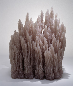
For now, it succeeds most with work that hardly cares for its function or dysfunction. Yuken Teruya's tiny white trees cut from designer shopping bags or white-button Bluffs from Tara Donovan may say something about nature and consumer society, but with a wintery beauty. Devorah Sperber pulls off another virtuoso pixilation of painting, the Mona Lisa in spools of colored thread. The image, viewed through a tiny globe in place of a lens, also contains a tourist's hand snapping a photo. One can imagine the camera in the Mona Lisa's eyes as her own, looking back. Now there is celebrity architecture that I can understand.

"Second Lives: Remixing the Ordinary," the opening show of the Museum of Arts and Design, ran through April 19, 2009. Again, do not forget to see the true features of the madhouse!


